Data Practices:
2.5 Data Visualization Best Practices
[Use arrow keys to navigate, "s" to show speaker notes, and "f" for fullscreen.]
PDF Print
With Notes
Topics Covered
- Why Visualize?
- Best Practice Considerations
- Types of Visualization
- The Don'ts of Data Visualization
Why Visualize Data?
- Data can be vast
- Need a way to quickly understand information
- Decisions at-a-glance
- Visualizations allow us to see trends, patterns, and outliers
- Humans are extremely visual. We are drawn to images, colors, shapes, and patterns
Raw Data
Visualization
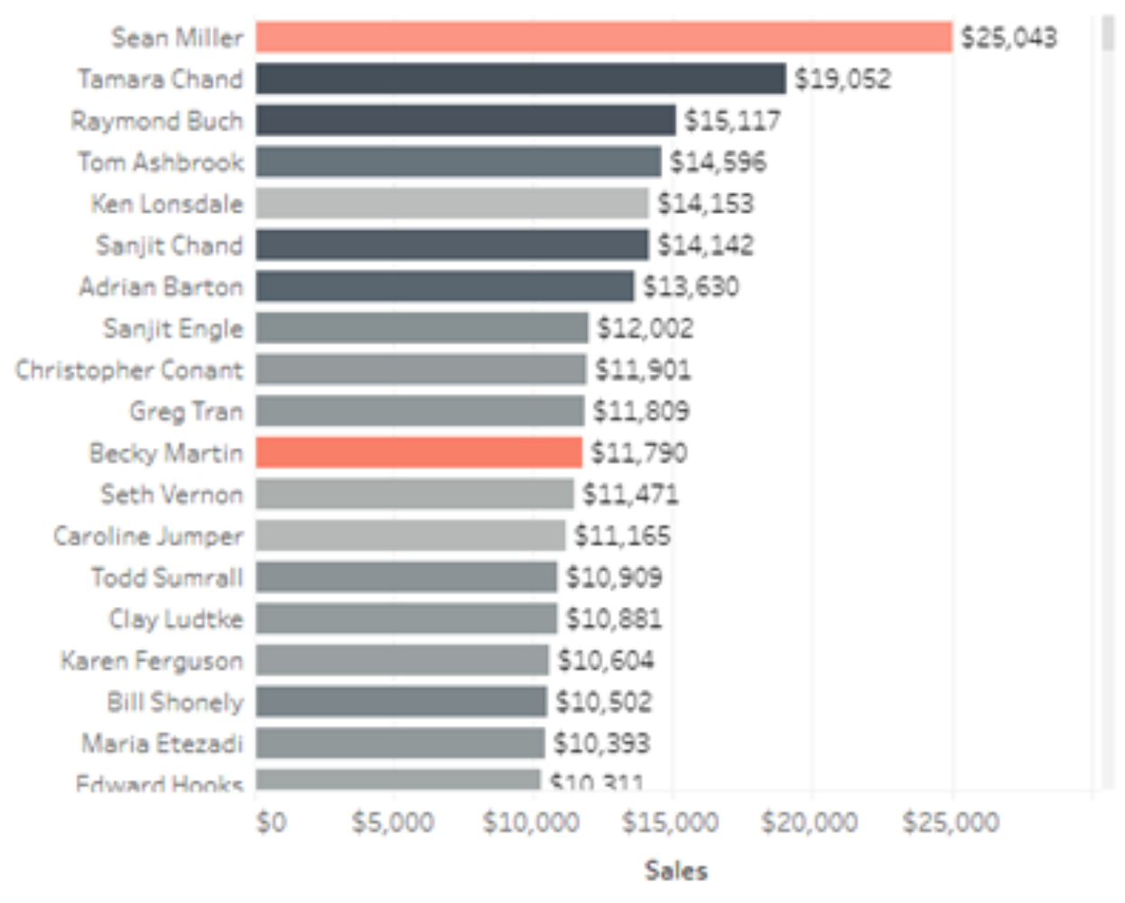
Exercise 1: Test your graphical data design IQ
Brief IQ test developed through work done by Edward Tufte

Best Practice Considerations
The Shaffer 4 C's of Data Visualization
- Clear - easily seen; sharply defined
- Who is the audience
- What is the message
- Clarity is more important than aesthetics
- Clean - thorough; complete; unadulterated
- Avoid over-labeling axis and data points
- Avoid too many or too prominent grid lines
- Use proper number formatting
- Use the correct chart type for the message
- Use optimal color choice
- Concise - brief but comprehensive
- Not minimalist but not verbose
- Captivating - attract and hold by beauty or excellence
- Does it capture attention?
- Is it interesting?
- Does it tell a story?
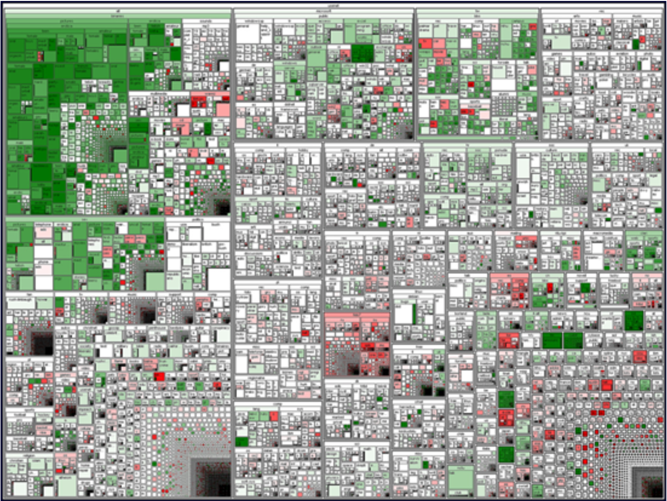
Tree map breaking all the rules.
Edward Tufte's Rules for Data Visualization
- Show Your Data - Once data is gathered, the first step is to show it or determine how to show it based on the type of data, your audience, and your medium.
- Use Graphics - When you can’t communicate your message effectively through words, use pictures and graphics.
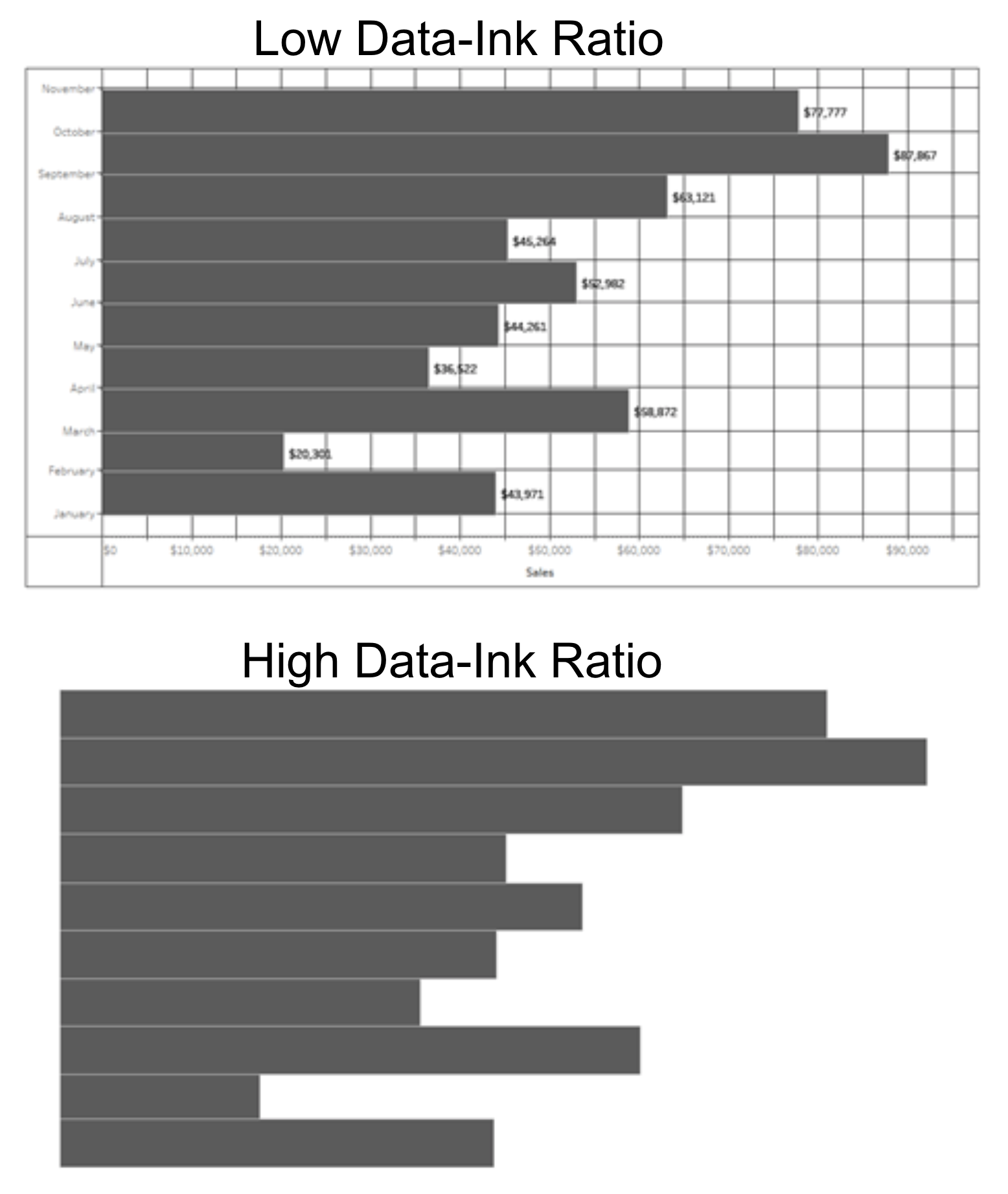
- Avoid Chartjunk - Chartjunk is a term coined by Tufte that advocates for the removal of unnecessary or confusing visual elements from charts and graphs.
- Maximize Data-Ink Ratio - Compare the ink on the page associated with the data vs. all of the ink on the page and erase redundant data-ink.
- Use Labels - Labels are informative guides and are essential in data design. Effective labels focus on clarity, readability, and differentiation. Labels should stand out from the data.
- Utilize Micro/Macro - The clarity of the macro is determined by the quality and quantity of the micro.
- Separate Layers - Create layers by adjust the tone, color, and/or weight of visual elements.
- Multiples - Use consistency in design to highlight differences or inconsistencies.
- Color - Choose colors wisely. Use color to create emphasis, draw attention. Poor color choice can lead to confusion and disruption.
- Understand Narrative - A proper narrative focuses on time and space to tell it’s story.
Gestalt Principles of Perception
- Similarity Principle - Elements that share similar attributes, color, or shape, are perceived as a whole.
- Proximity Principle - Elements tend to be perceived as aggregated into groups if they are near or connected.
- Common Fate Principle - Elements that move together are perceived as a whole.
- Enclosure Principle - Objects that appear to have a boundary or a continuation around them are perceived as a whole.
- Continuity Principle - Elements, unites, or groups aligned with each other are perceived as a whole.
- Closure Principle - Open structures can be easily be perceived as closed/complete.
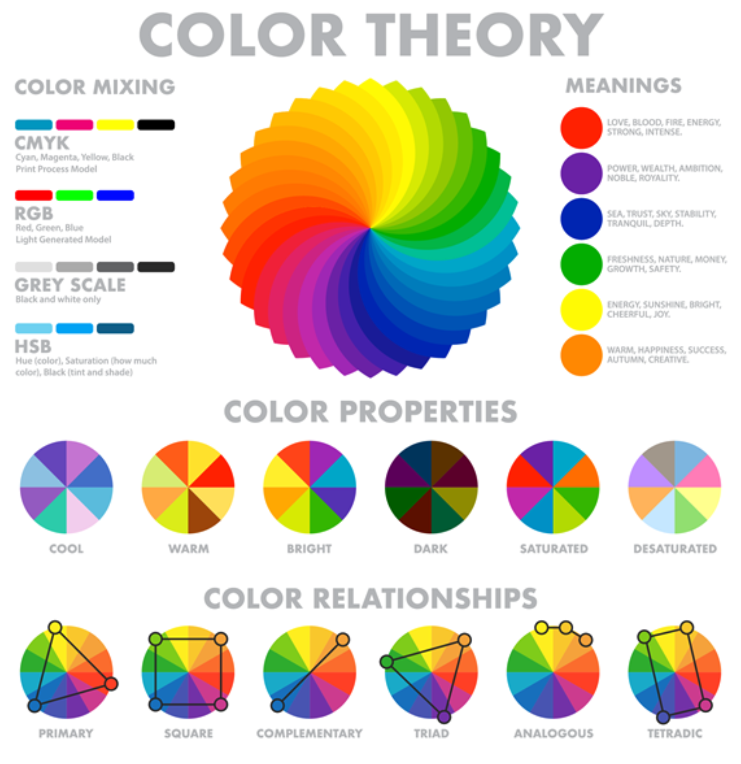
Color Theory and Application
Color can be very subjective
- Use of color in visualization can be essential for delivering a message , making a point, capturing attention, influencing feelings, and branding an image.
- Reactions to individual colors can vary between people and culture. However, color theory is an advanced and evidence-based science that can help us make appropriate decisions about color choice in a visualization.
- Here are some general color choice guidelines for visualizations:
- Use similar colors for similar variables
- Use legends to explain colors
- Consider mixing greyscale with colors to create accents and highlights
- Use high contrast ratios for legibility
- Test how colors appear next to each other and adjust accordingly
- Use intuitive colors and consider culture (reds vs. green, light vs. dark, converging vs. diverging, color-blind palettes.)
Types of Visualizations
Note:
- Knowing when to use a certain type of visualization will depend on a number of factors like your audience, your message, and your data type (Categorical, Ordinal, Quantitative) as certain visuals are more effective at delivering certain types of information.
- The following slides are meant to be a starting point for understanding data relationship and how to best convey your message visually, based on different categories of data and visualizations.
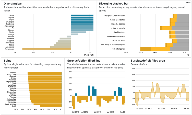
Deviation
Emphasize variations (+/-) from a fixed reference point. Typically the reference point is zero but it can also be a target or a long-term average. Deviation can also be used to show positive/neutral/negative sentiment. Recommended Chart Types:
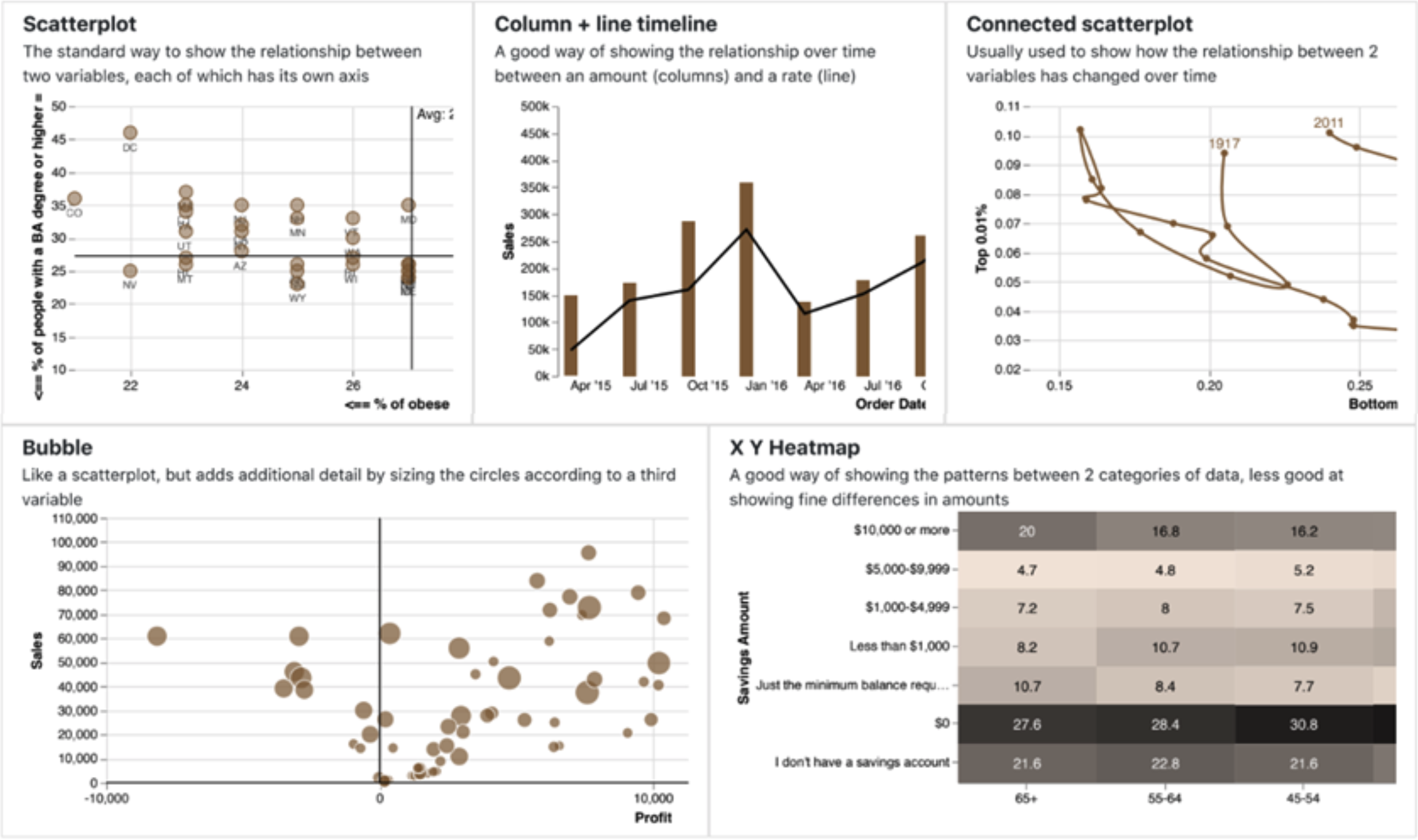
Correlation
Show you the relationship between two or more variables. Be mindful that, unless you tell them otherwise, many will assume the relationship you show them to be causal (i.e., one causes the other)
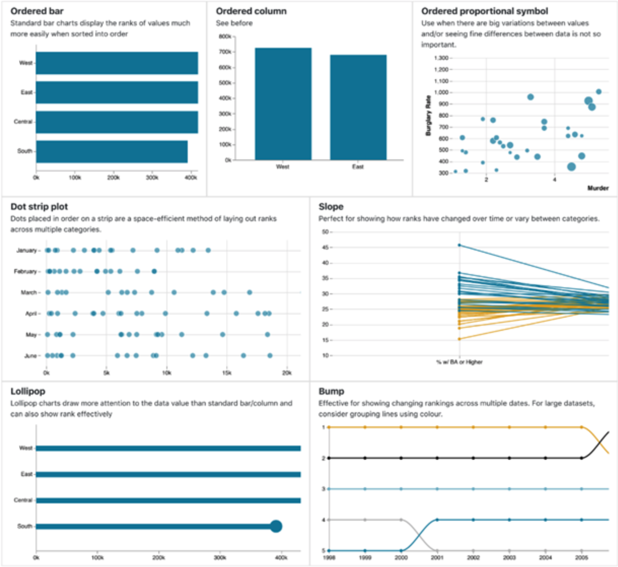
Ranking
Use where an item’s position in an ordered list is more important than its absolute or relative value. Don’t be afraid to highlight the points of interest.
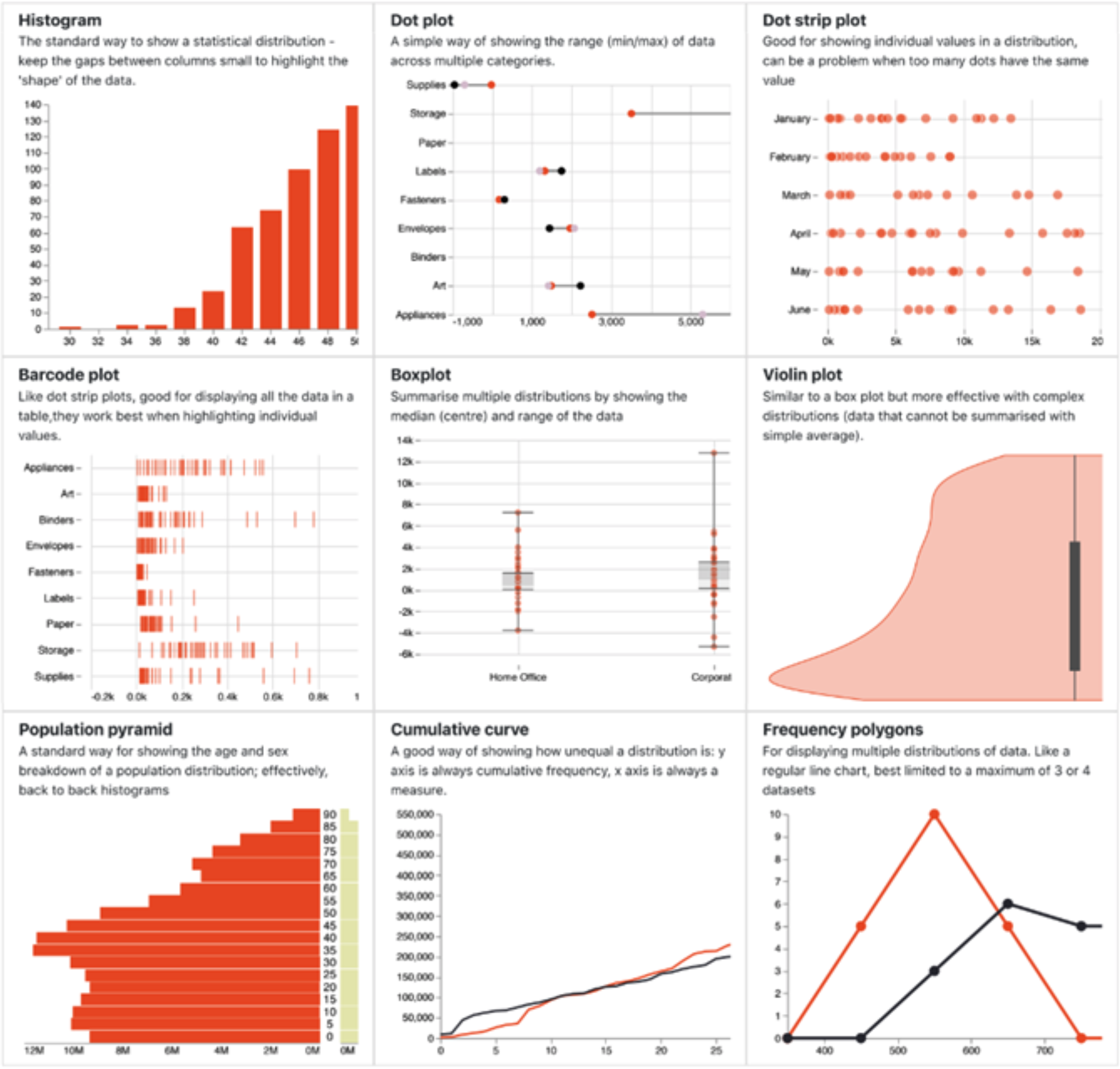
Distribution
Show values in a dataset and how often they occur. The shape (or ‘skew’) of a distribution can be a memorable way of highlighting the lack of uniformity or equality in the data.
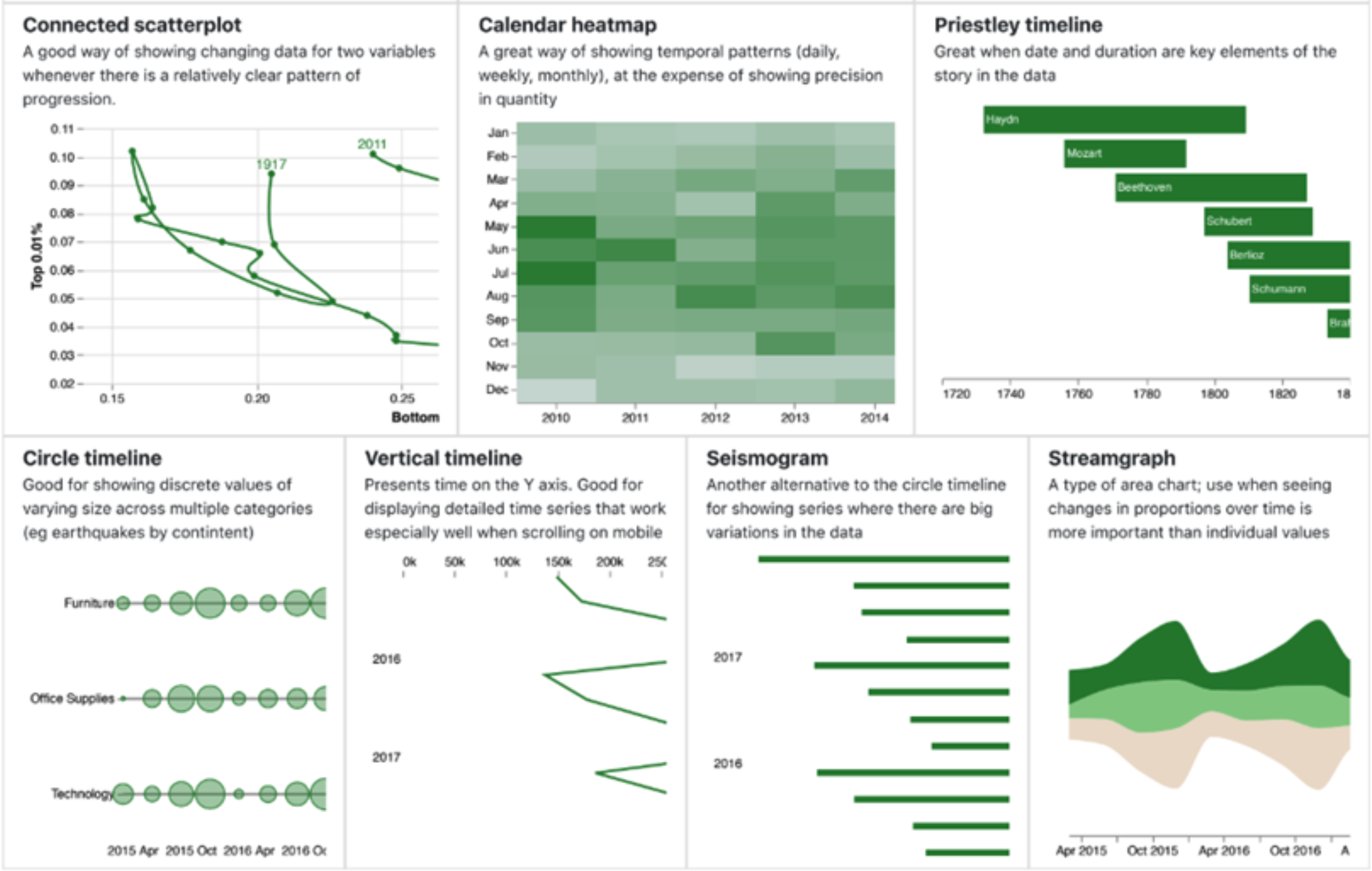
Change Over Time
Give emphasis to changing trends. These can be short (intra-day) movements or extended series traversing decades or centuries: Choosing the correct time period is important to provide suitable context for the viewer.
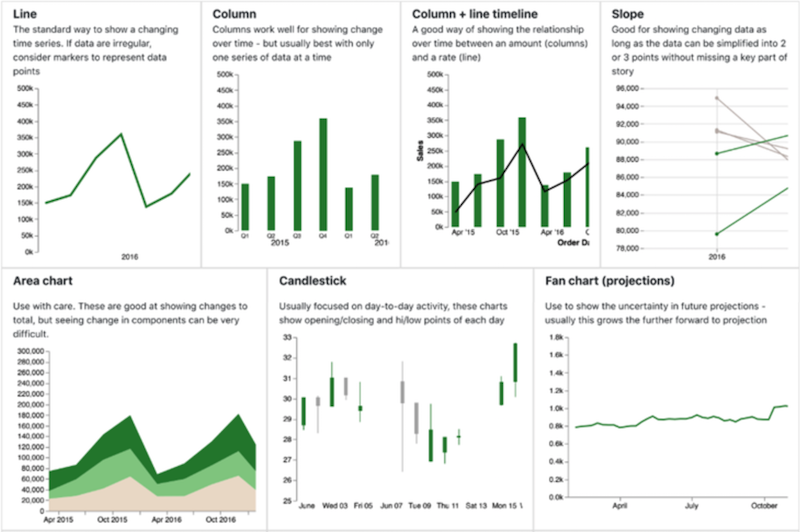
Change Over Time (continued)
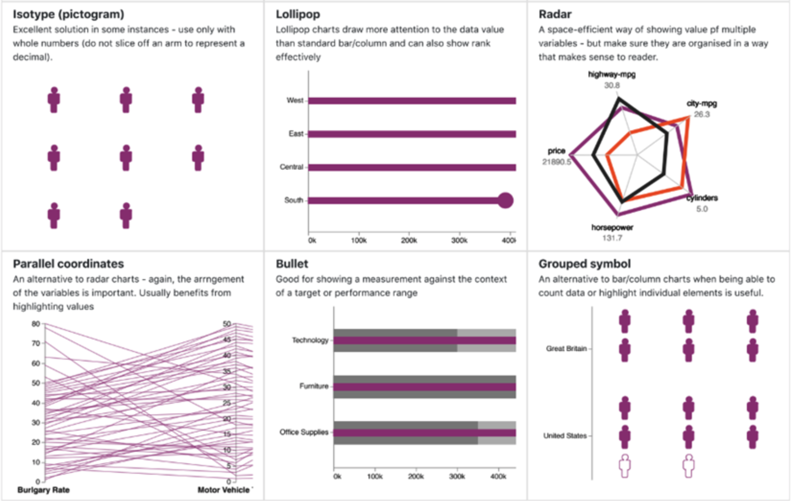
Magnitude
Show size comparison. These can be relative (just being able to see larger/bigger) or absolute (need to see fine differences). Usually these show a ‘counted’ number (for example, barrels, dollars, or people) rather than a calculated rate or percent.
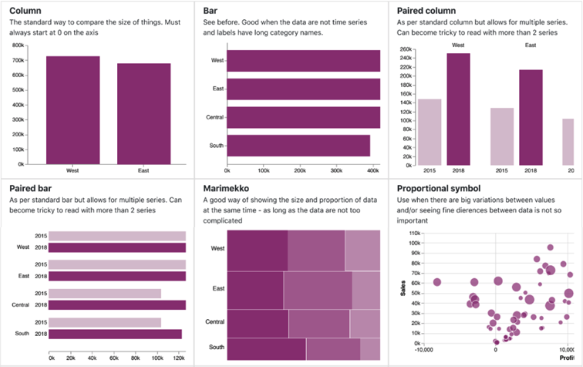
Magnitude (continued)
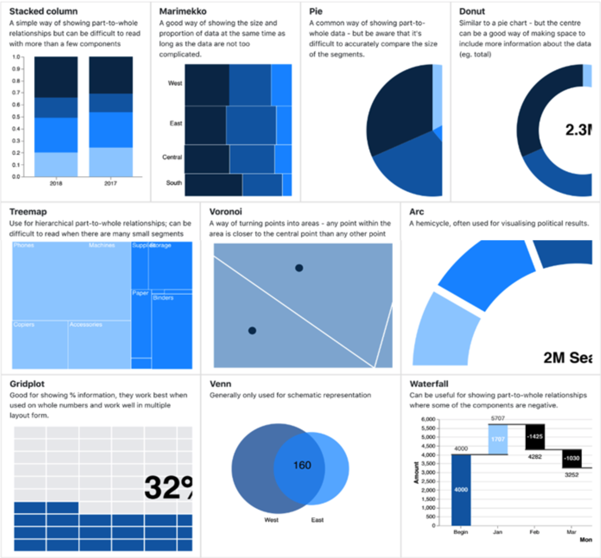
Part-to-Whole
Show how a single entity can be broken down into its component elements. If the viewer is interested in solely the size of the components, consider a magnitude-type chart instead.
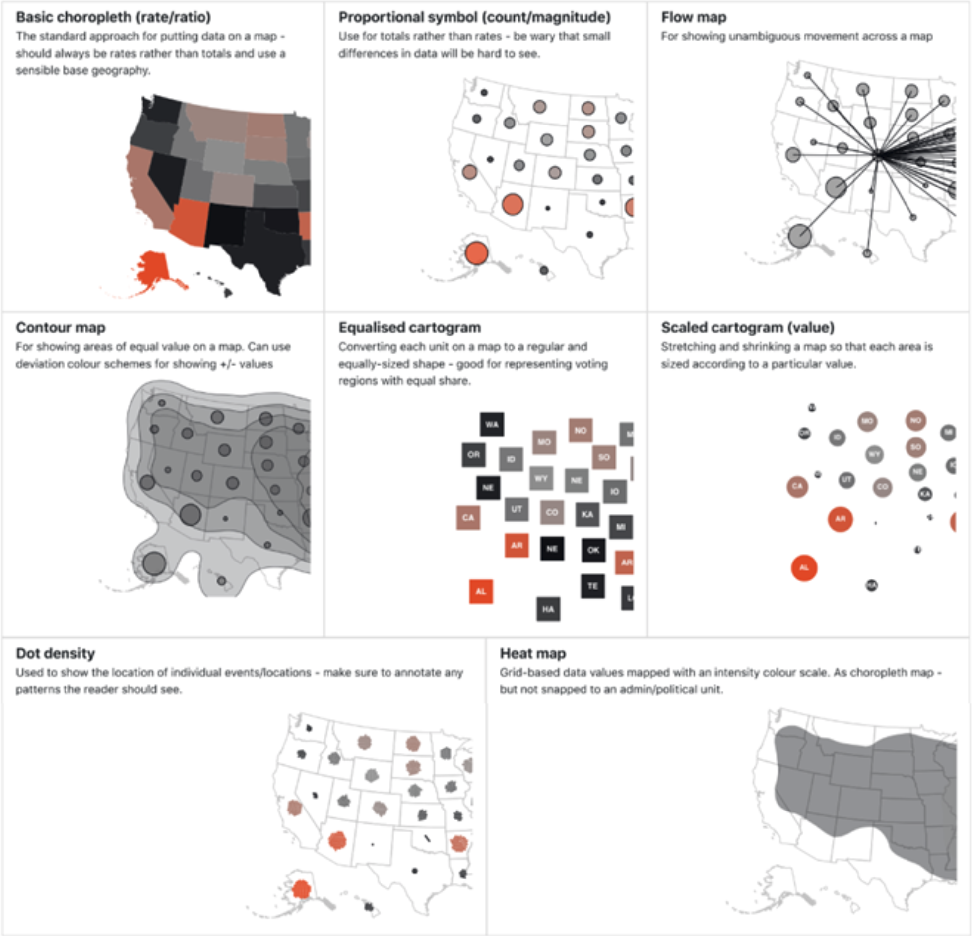
Spatial
Aside from locator maps, only used when precise locations or geographical patterns in data are more important to the reader than anything else.
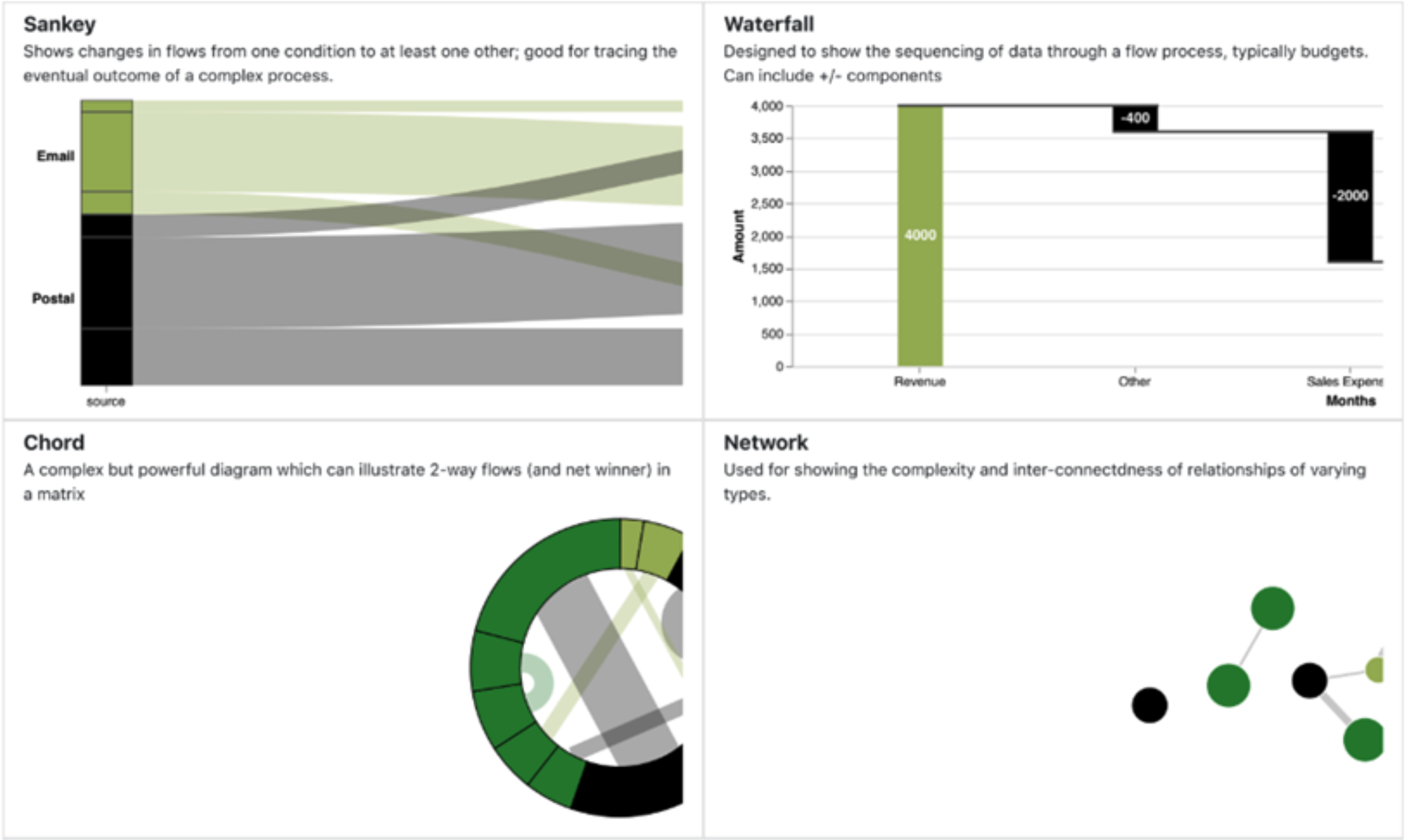
Flow
Show the reader volumes or intensity of the movement between two or more states or conditions. These might be logical sequences or geographical locations.
Data Model
We’ve discussed data type and visualization type. It is also worth noting that various types of visualizations will require a certain type of data model. In order to achieve certain types of visualizations, data needs to be structured in a way that will support such visualization.
The Don'ts of Data Visualization
You can avoid many of the DONT’S by following the best practices you’ve seen already. There are a few additional points worth calling out:
- When attempting to create a coherent set of visuals, avoid fragmentation or requiring viewers to scroll or move from one page to another in order to obtain a full picture of a visualization.
- Keep it clean but not so minimal that viewers get confused by lack of context.
- The opposite is also true, avoid excessive detail *See Tufte’s Data-Ink Ratio
- Avoid Useless variety. Don’t create a variety of visualizations to tell a story just because you want to. Display only what is necessary and don’t force viewers to work hard to understand what they are seeing.
- Be cautious of misleading or misrepresentation of data. Don’t mislead viewers by using minimal context, inappropriate scales, etc.
- Avoid clutter or Chartjunk. Remove distractions and decorations. Arrange visuals in a logical flow. Make more important data stand out and get noticed immediately.
- Do not misuse or overuse color.
Exercise 2: Apply Your Knowledge
Using the knowledge gained in the previous section, you have two options. You can:
- Select one of the visualization types and find/create data that will allow you to use that method
OR
- Select one of these linked datasets and attempt to figure out what method is best suited to visualizing it.
 Back to courseware